

Black is indeed elegant, but charcoal gray is on the trend right now. It’s the best alternative for black and provides the same elegance minus the total darkness.
Charcoal gray is also considered one of the bold colors that can add depth and drama to your room.
- Benjamin Moore – Kendall Charcoal Kitchen Cabinets Paired with Collande Gray Walls
- Behr – Carbon Charcoal Kitchen Cabinets in a Low Sheen Enamel
- Behr – Mined Coal Kitchen Cabinets with White Backsplash
- Hanssem – Lunar Gray Cabinets in a Transitional Kitchen
- Benjamin Moore – Timber Wolf Charcoal Cabinets Paired with Dark Tone Kitchen Island
- Sherwin Williams – Porpoise Charcoal Kitchen Cabinets with Gold Granite Countertops
- Dunn Edwards – Charcoal Smudge Cabinets in a Scandinavian Kitchen
- Charcoal Gray Island Cabinet from Signature Cabinetry in Smoke Color
- Kith Cabinets in Creekstone Charcoal Gray Color Paired with Wooden Top
- Sherwin Williams – Intellectual Charcoal Gray Cabinets with Granite Countertops
- Porter Paint – Gray Bronze Charcoal Cabinets in a Traditional Kitchen
- Benjamin Moore – Flint Island Cabinet with Charcoal Soapstone Countertop
The easy way to incorporate charcoal gray in a kitchen is through cabinetry. It would look good if you’re able to contrast it.
Unlike black, charcoal gray cabinetry has undertones that can complement the surrounding colors to enhance the visual attraction of the kitchen.
When it comes to tones, typically, charcoals are cool tones. But, since there are many shades, there is also some warm-toned charcoal shade, like warm greiges or warm grays.
With a lot of options, you need to find the right charcoal color to paint your cabinet and fit your color scheme.
The upsides of having charcoal kitchen cabinets are they are able to emanate a modern and sophisticated look.
Nothing’s more trendy and stylish than charcoal shade, and it looks perfect in contemporary, minimalist, urban, modern, or even Scandinavian styles.
Always rely on charcoal kitchen cabinets if you’re looking for something fresh and trendy.
Want to know more about charcoal shade?
Below, we’re going to pop the best charcoal paints for your kitchen cabinets and the complementing colors to surround them to create a visually balanced kitchen.
Keep in mind that these colors may look different in real life due to the lighting when the picture was taken.
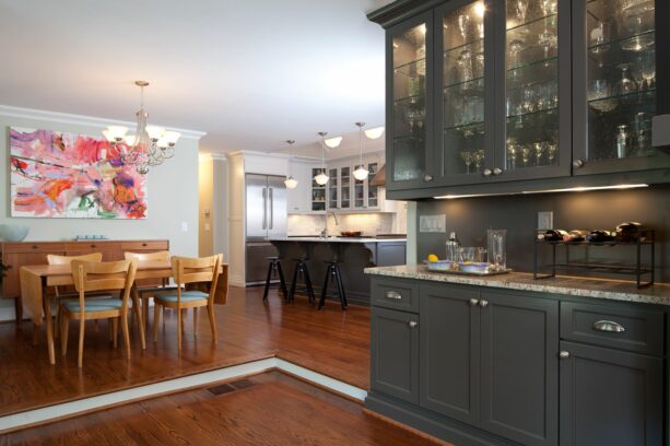
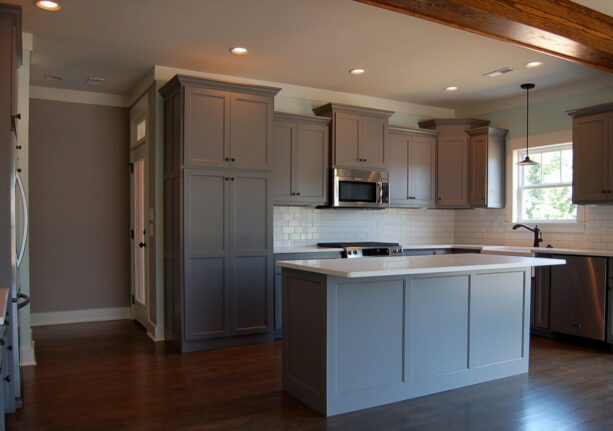
1. Benjamin Moore – Kendall Charcoal Kitchen Cabinets Paired with Collande Gray Walls
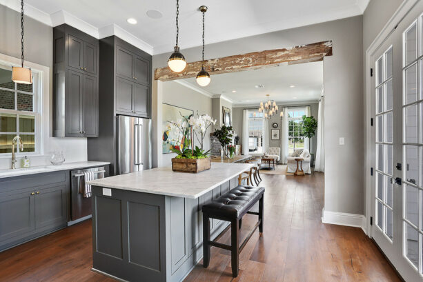
From the color palette, it’s easy to see that this kitchen features a traditional style.
The combination of charcoal gray and white, with a touch of the wood element, will always exude a classic look.
The wood floor is Baroque Flooring Luxembourg in “Kimpton”. On the other hand, this cabinetry is painted in Benjamin Moore – Kendall Charcoal.
Kendall Charcoal is one of the most popular charcoal paints on the market.
This is a dark gray shade with green and yellow undertones. This is the kind of shade that you should choose if you want to incorporate an earthy tone in your space because it is highly saturated; thus, it looks extremely earthy.
Kendall Charcoal is an excellent neutral paint color that goes very well with creamy or crispy white.
However, to subtly contrast the charcoal cabinets, the designer painted the walls in Sherwin Williams – Collande Gray SW 7641.
White is also used, but also in a small amount because we can see that this is a large and open floor plan kitchen. Hence, the charcoal cabinetry won’t make the area look dark and small.
The white color is painted on the trim and ceilings, Sherwin Williams – Pure White SW 7005.
To create a visual balance look, the charcoal cabinetry is paired with slab countertops made of Carrara marble in white color with dark veining. It matches the backsplash flawlessly, looking bright against the charcoal cabinets.
2. Behr – Carbon Charcoal Kitchen Cabinets in a Low Sheen Enamel
This transitional kitchen looks small but isn’t enclosed, so it’s safe to use charcoal shade for the cabinets.
The cabinets in this project are from Plain & Fancy. They are painted in Behr – Carbon, a lovely charcoal gray, in a low sheen enamel.
The walls are painted in Benjamin Moore – Decorator White, matching the white tiled backsplash from Ann Sacks and the white Caesarstone countertops.
A peninsula is attached to the white walls and painted in a charcoal gray to create cohesion with the cabinets in the kitchen perimeter.
We can see that white is a dominant color in this transitional kitchen. The white canvas and the charcoal cabinetry bring out a modern style in this kitchen.
The light tone wood floor, on the contrary, contrasts them both. Instead of modern, it emanates a traditional look.
When combined together, the white walls, the charcoal cabinets, and the light tone wood floor give a spotless transitional look.
Pro tip: to liven up the white-charcoal kitchen, adding a runner with a black and white pattern is good. The Black and white runner will represent the color scheme of the kitchen. It would be better if you managed to find the runner in dark gray and white.
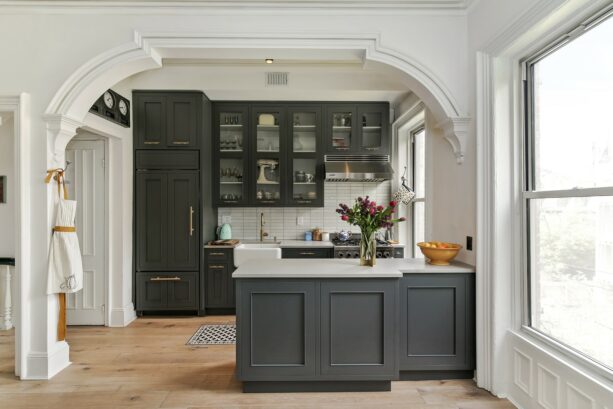
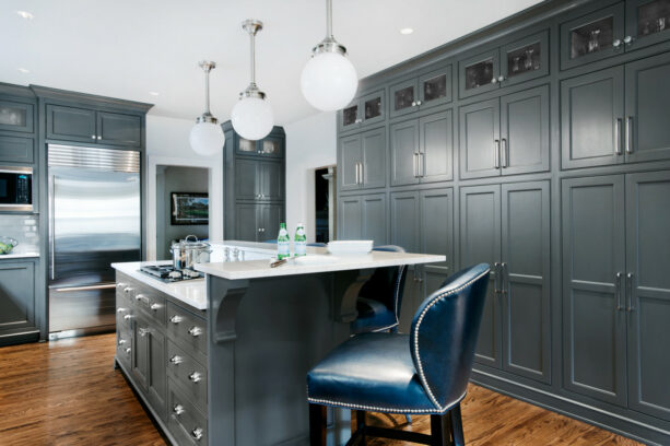
3. Behr – Mined Coal Kitchen Cabinets with White Backsplash
If space is not an issue, using a lot of dark shades in your kitchen will boost the elegance and instantly add a luxe look. Look how the designer decorated this transitional kitchen.
The cabinets are painted in Behr – Mined Coal. To add more depth, the designer used Basalt limestone in black color, which is much darker than the cabinets.
Even the stools of the island are also finished in gray to match the cabinets in the perimeter of the kitchen and the island.
Still, contrast is needed. Adding a bright and light tone will balance the dark shade of your kitchen, making it look more stylish.
The countertops are Miele marble in white color for the island. However, on the perimeter, the tops are leather finished granite in black color.
Using black granite countertops in the charcoal cabinets is meant to contrast the white subway tile backsplash.
The charcoal cabinets are also supposed to look pop against the white walls as a canvas. If you want to duplicate this look, adding stainless steel appliances like this won’t hurt.
Don’t forget to add proper lighting to illuminate the whole area. Using glass pendants over the charcoal island will add a modern look, similar to the charcoal cabinets and granite tops.
4. Hanssem – Lunar Gray Cabinets in a Transitional Kitchen
This is a simple galley kitchen. Like the usual galley kitchen, space is quite a problem. It means that the designer had to work creatively in a limited space. That’s why they didn’t use too many dark tones.
It’s worth knowing that any dark tones, not just black, will overwhelm a small room. They will only make the area look smaller.
So, the designer opted for the full overlay cabinets in Hanssem – Lunar Gray. This is a lighter tone of charcoal gray.
For your information, the cabinets are not painted; they are a stock color. Choosing a stock color cabinetry is a simple and easy way to incorporate charcoal shade. This way, you can start from the cabinets and work your way around them.
To make the kitchen look warmer, the designer paired the lunar charcoal gray with Caesarstone Classico – 5131 Calacatta Nuvo countertops, which appear to be a soft and light gray similar to the backsplash.
The charcoal cabinetry is also completed with Satin brass hardware from Charlie’s Collection.
Look how the brass finish of the hardware looks prominent against the soft and light charcoal cabinetry.
The combination of charcoal gray and soft and light gray, along with brass hardware, is very much highlighted by a lot of lighting in the kitchen.
5. Benjamin Moore – Timber Wolf Charcoal Cabinets Paired with Dark Tone Kitchen Island

It’s good to see the two-tone cabinetry in this traditional kitchen.
The cabinets in the perimeter are painted in Benjamin Moore – Timber Wolf, paired with quartzite countertops in “Super White” color. The island cabinet, on the contrary, is painted in a much darker tone that looks almost black.
Actually, charcoal cabinets and black don’t complement each other. But, painting the island in such shade will make it look prominent against the charcoal cabinets on the perimeter.
This is a great way to make a statement. In a traditional kitchen, it’s quite rare to see a statement piece with a bold color. But that doesn’t mean you can make it.
To make a focal point, place an island right in the center of the kitchen and paint it in a bold, deep, yet neutral shade to contrast the cabinets in the perimeter.
Both the charcoal perimeter cabinets and black island are neutral colors. Combining two neutral colors will contradict each other. It proves that it takes no bold color to create a contrast in a traditional room.
The designer also added contemporary pendants over the black island as a finishing touch.
Generally, the overall look of this kitchen is quite simple. But, the statement piece makes it look extra.
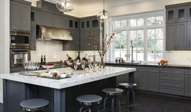
6. Sherwin Williams – Porpoise Charcoal Kitchen Cabinets with Gold Granite Countertops
This is an open-concept kitchen that shares a space with a dining room.
From the color scheme, we can see that the charcoal cabinets are meant to be an accent. The kitchen itself is painted white.
Even the cabinetry itself is two-toned. The upper one is painted in Sherwin Williams – Extra White, similar to the walls around, so the uppers blend seamlessly with the walls and the ceiling.
The island and the rear cabinets in this picture are painted in Sherwin Williams – Porpoise, a cool charcoal shade to contrast the extra white surrounding.
The countertops are meant to complement the charcoal cabinets instead of opposing them. They are Gold Ornamental granite tops. It’s just lovely to see how they complete each other.
Frankly speaking, charcoal and white are the most common and typical color combo.
If you want to replicate this look, make sure you add something different to boost the visual aesthetic of your kitchen.
For instance, the designer hung a bright and colorful artwork on the wall in this area. The artwork works as a piece to brighten up the whole kitchen.
As an alternative, you can also make a statement through the lighting. Opt for whimsical and unique hanging pendants, or even a chandelier, to attract more attention.
It’s wrong to think that a Scandinavian room should always be filled with light tone wood and white color.
Even though light tone wood and white are often associated with that style, there are many ways to redefine the Scandinavian look.
For instance, in this project, the designer incorporated a charcoal shade in a Scandinavian kitchen.
The cabinetry and the island are painted in Dunn Edwards – Charcoal Smudge. This is the kind of charcoal that goes darker and deeper than the usual charcoal shades. That’s why this can work as the best alternative to black.
Since this shade looks almost black, you can decorate it as if it were black. This cabinetry is paired with gold-finished hardware.
Gold finished hardware is actually a perfect match for black cabinets because black and gold will work together to create a glamorous and luxurious look. But, it turns out that gold-finished hardware also goes well with charcoal cabinets.
In order to highlight the Scandinavian style, the designer picked a light tone wood floor that dramatically contrasts the deep charcoal cabinets.
The stools in the breakfast bar are also made of dark tone wood, another wood element to enhance the Scandinavian style.
You can add a dark tone to a Scandinavian room with the right composition without disrupting the original look.
8. Charcoal Gray Island Cabinet from Signature Cabinetry in Smoke Color
This cabinetry is not painted. It’s a ready stock color from the cabinet manufacturers.
These cabinets are from Signature Cabinetry, and the charcoal gray is represented by the Smoke color. The smoke color is only on the island, while the perimeter cabinets are in a bright white shade.
This charcoal shade is also deep and dark, quite the same as the previous picture.
If you fill your kitchen with white to maintain its spotless and bright look, it would be nice to add an accent.
The accent should be a contrasting color to create a drama. This island proves it nicely. The dark charcoal shade adds dramatic contrast to its surrounding.
Moreover, it’s paired with a white countertop that matches the top in the perimeter.
How perfect is this charcoal island as a focal point. Since the rest of the kitchen has been decorated with a soft, light, and bright shade, you should make sure the centerpiece is on point.
It’s recommended to focus on the charcoal island as a statement piece. Add some stools in front of it to make a breakfast bar. It would be nice if the stools were in a cream or beige color to soften the dark charcoal shade.
9. Kith Cabinets in Creekstone Charcoal Gray Color Paired with Wooden Top
The charcoal shade of these cabinets is ready stock, not a painted one. The cabinetry is from Kith Cabinets, and the color is Creekstone, which is a charcoal gray.
This is the kind of neutral charcoal that is not too dark or too light. This is the kind of charcoal shade that will perfectly fit any transitional kitchen because it’s both traditional and modern.
To make these charcoal cabinets look more pop, the designer paired them with white paneled appliances and wood countertops. It’s actually a bit odd to see a wooden top paired with charcoal cabinets.
Far from complementing each other, they look unusual against each other. But actually, that’s part of the charm.
The unusual appearance is always tempting and irresistible, especially if you want to stay away from a mainstream decoration.
The glossy white backsplash blends seamlessly with the vent hood and the white walls, and they work as a backdrop to enhance the dramatic look of the charcoal cabinets.
You can incorporate brass hardware like this to complete the stylish charcoal cabinets. Brass hardware in recessed panel cabinetry delivers a traditional look, but the charcoal shade makes it look more modern.
10. Sherwin Williams – Intellectual Charcoal Gray Cabinets with Granite Countertops
This kitchen proves that charcoal cabinets don’t only work in traditional, modern, contemporary, or minimalist styles but also in a craftsman design.
This is a craftsman’s kitchen. You can see it from this kitchen’s prominent dark tone wood and wood element. The strong straight lines of this kitchen are also proof that this is an arts and crafts room.
However, instead of being designed in a natural wood tone, the designer managed to decode an array of colors here. The kitchen incorporates the mixture character of gray, white, and dark tone natural wood.
The cabinets are painted in Sherwin Williams – Intellectual Gray, while the backsplash is white subway tile. The white granite countertops complement both the perimeter cabinets and the island.
Since the charcoal shade here is light, it beautifully contrasts the dark wood floor.
This kitchen is not that spacious. The dark wood floor like this is enough to make the whole area look dark and smaller. That’s why Intellectual Gray opted to paint the cabinets.
The light charcoal shade, along with the white backsplash, white countertops, white ceiling, and white walls, will counter the dark floor.
11. Porter Paint – Gray Bronze Charcoal Cabinets in a Traditional Kitchen
This traditional kitchen looks stylish with such charcoal cabinets.
The cabinets are painted in Porter Paint – Gray Bronze. It seems that the cabinets are also finished with lacquer to achieve a polished and glossy look like this.
This is an excellent idea to adopt. A combination of charcoal gray and lacquer finish will instantly boost the stylish look of the kitchen despite the traditional style.
The imposing part of this kitchen is the cabinets because they stand from floor to ceiling. Whatever paint you choose for this kind of cabinetry will dominate the whole room.
That’s why even though this kitchen has a medium-tone wood floor and white walls and countertops, the first impression that catches the most attention is still the charcoal shade.
You’ve seen charcoal cabinets paired with gold-finished and brass hardware.
Yes, they can make enhance the luxurious look of a kitchen. But if you want to add an ultra-modern touch to a traditional kitchen, you can add steel hardware to charcoal cabinets.
Steel is an element that’s usually related to a modern and urban style. Incorporating this in a traditional area will subtly create a contrast.
12. Benjamin Moore – Flint Island Cabinet with Charcoal Soapstone Countertop
Actually, both the perimeter and the island cabinets have a charcoal gray shade. However, the cabinetry is painted in custom mixed color, hand painted in Dillons, while the island is painted in Benjamin Moore – Flint.
The charcoal shade on the island looks a bit softer and lighter than the cabinets in the perimeter, but they’re not very much different.
Differentiating the island and the cabinets in two almost identical shades is an excellent way to create a vague contrast that won’t draw too much attention.
It might be hard to find two almost identical shades that subtly contrast each other. The most reasonable way is to custom mix one of them to create a darker or lighter version of the manufactured paint.
Despite the fact that the cabinet and the island are different, the cabinetry itself is basically two-toned. The huge freestanding one is in the charcoal shade, while the base cabinets are painted white.
Just like any transitional kitchen, white is a must-have shade to make the complementary color look more prominent.
To correspond with the deep charcoal shade of the perimeter cabinets, the designer incorporated a charcoal soapstone countertop.
On the other hand, the island with a lighter charcoal shade is paired with Calacatta Paonazzo marble in white color.
It’s easy to see that the color scheme in this kitchen is very well thought out. Each of them works well with the other, creating a coherent look.
Closing
Now you know that charcoals and grays are never boring. In fact, charcoals are a unique shade when they can be neutral and bold at the same time.
Don’t forget that it’s elegant and sophisticated, too. No matter if you use the charcoal kitchen cabinets for all cabinetry in your kitchen or just as a beautiful accent, charcoals will never fail to make a statement anywhere you put them.
Naturally, charcoal shades will make the room appear smaller.
Even though it is not black, it is a dark shade, which means that it will deliver a “slimming” effect. This way, you have to be able to pair it with other bright tones, especially white.
If you’ve got a small kitchen, make sure the ratio of white is larger than the charcoal. Incorporating white in your charcoal kitchen will not only create contrast but also counteract the darkness effect.
Speaking of contrast, people usually paint the walls around the charcoal kitchen cabinets in a lighter tone.
While some of these colors may not appear on the list above, here are the excellent coordinating wall colors for charcoal kitchen cabinets: Sherwin Williams – Pure White, Sherwin Williams – Snowbound, Sherwin Williams – Ice Cube, Benjamin Moore – White Dove, Benjamin Moore – Edgecomb Gray, Benjamin Moore – Gray Owl, Benjamin Moore – Smoke, Behr – Silver Feather, Behr – Upbeat, and Behr – Platinum.
Always count on LRV (Light Reflective Value) if you’re looking for the right charcoal shade. It’s because usually, it’s quite challenging to tell if the shade is darker or lighter if you’re comparing two almost identical hues.
LRV is a 0-100 scale; 0 is a true black, and 100 is pure white. This scale will show how much light is bounced back in a paint color.
If your home doesn’t have a lot of natural light, it’s recommended to choose shades that are closer to 100 when to avoid being too dark.
Don’t forget to test it out. Never pick a paint color based on the swatch looks in the store. It will drastically change when you paint it on your cabinets.
The solution is to get some samples from the paint store to test on your cabinets.
You can paint it on a white poster board and tape it to your cabinets and see how it looks and corresponds to the floor, walls, other furniture pieces, and your entire kitchen. This way, you’ll get the best result.